Headshot Background Ideas: What Works by Industry (and What to Avoid)
Matthieu van Haperen
Founder & CEO, TeamShotsPro · Updated Mar 2026
TL;DR: Quick Answer
Neutral, clean backgrounds outperform busy scenes for most professional use cases.
Pick one primary background style and one approved fallback — do not allow unlimited options.
Tune background choice to your industry's trust signals, not personal taste.
Keep contrast between subject and background high enough for clear facial definition at thumbnail size.
Standardizing background rules is the fastest way to improve how your team looks online.
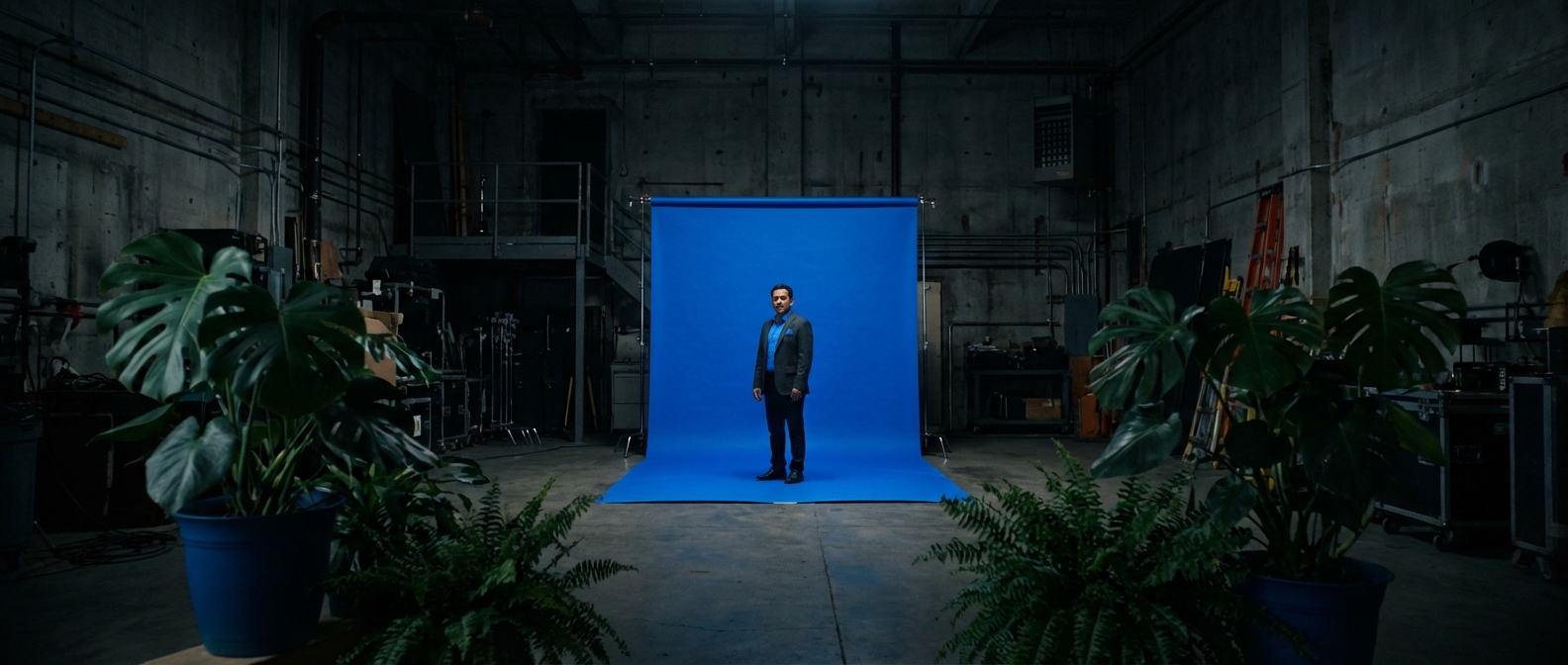
If your team photos look inconsistent, the first thing to fix isn't pose, outfit, or editing. It's background.
Background does three jobs at once. It signals professionalism in under a second. It sets emotional tone, whether formal, approachable, or premium. And it determines whether a team page looks unified or patched together.
Most teams skip this decision entirely. Everyone uploads whatever looks "fine," and then the website feels visually noisy. One background policy fixes that across every hire, every office, and every profile surface.
TL;DR
- Neutral, clean backgrounds outperform busy scenes for most professional use cases.
- Pick one primary background style and one approved fallback. Don't allow unlimited options.
- Tune background choice to your industry's trust signals, not personal taste.
- Keep contrast between subject and background high enough for clear facial definition at thumbnail size.
- Standardizing background rules is one of the fastest ways to improve how your team looks online.
Why Background Matters More Than Most Teams Think
When prospects compare two professionals side by side, they make quality judgments in milliseconds. Background clutter reads as lower professionalism, even when the person is highly qualified.
A polished background doesn't need to be dramatic. It just needs to be intentional.
For teams, the impact compounds:
- Inconsistent backgrounds make your brand look decentralized and improvised.
- Consistent backgrounds make even a five-person team look established.
- Better visual consistency increases trust on the pages where it matters most: team pages, sales decks, listings, and proposals.
For a broader team implementation workflow, see Professional Team Headshots in 2026. For a complete guide to what makes headshots work, see our Professional Headshots Guide.
5 Professional Background Styles (and When to Use Each)
1. Soft Neutral Studio
Best for: SaaS, consulting, agencies, general B2B, cross-functional teams.The safest company-wide default. Warm grays, cool grays, off-whites, or muted beige tones keep attention on the person while still feeling premium. Works well across skin tones and clothing colors, which matters when you're standardizing across a diverse team.
This is the right starting point if you need one style that works for every role from engineering to sales.
2. Bright Clean White
Best for: healthcare, product-led startups, support teams, knowledge base author photos.Feels clean and modern. Excellent for small profile thumbnails because there's nothing competing with the face. Makes content blocks and team grids look organized.
The tradeoff: white can feel sterile if overused, and it requires controlled lighting to avoid washing out faces. Without consistent exposure, some team members end up washed out while others look fine. That defeats the whole point of standardizing.
3. Dark Executive Gradient
Best for: financial services, law firms, enterprise sales leadership, C-suite bios.Communicates gravity and authority. Charcoal-to-slate gradients create strong contrast with lighter shirts and skin tones, which makes these photos perform well in leadership bios and speaking profiles.
The tradeoff: can feel too formal for culture-first brands, and dark clothing blends into the backdrop. If you use this style, pair it with wardrobe guidance so the face stays the focal point.
4. Subtle Office Environment
Best for: real estate, customer-facing teams, recruiting pages, community-driven brands.Feels human and accessible. A lightly blurred office or workspace background adds context without distracting detail. Professional, but not corporate.
The tradeoff: consistency breaks fast if the background detail varies too much between photos. A useful rule: if you can identify specific objects in the background, it's too busy. Blur level should be standardized.
5. Brand-Tinted Minimal
Best for: mature marketing teams with established brand systems.A muted tint of your brand color creates a distinctive, recognizable look across team pages, social profiles, and campaign assets. This is the most advanced option and the hardest to get right.
The tradeoff: easy to overdo saturation, and tinted backgrounds can clash with certain clothing or skin tones. Use muted tints, not pure hex colors. Test across a representative sample of your team before rolling out.
Background Recommendations by Industry
Different industries signal trust differently. Here's what aligns with buyer expectations in each one.
Real Estate
Go with: soft neutral or subtle office environment.Clients want approachable competence. Warm gray neutrals or lightly blurred modern office tones with high brightness and natural contrast strike the right balance. Overly dramatic backgrounds feel salesy; plain passport-style backgrounds feel generic.
If you're building a full agent-photo rollout, pair this with AI Headshots for Real Estate Agents.
Financial Services
Go with: dark executive gradient or clean cool-neutral studio.Buyers in this category evaluate trust and authority immediately. Charcoal-to-slate gradients with controlled highlights and conservative composition signal stability. Avoid trendy visual effects. Stability beats novelty in finance.
Law Firms
Go with: neutral-to-dark formal backgrounds.Legal brands benefit from visual signals of precision and seriousness. Deep gray or blue-gray backgrounds work well here, paired with structured crop and low visual noise.
For legal-specific rollout guidance, see AI Headshots for Law Firms.
Healthcare
Go with: bright clean backgrounds with softer contrast.Healthcare professionals need to balance authority with warmth. White or very light cool-neutral backdrops with gentle lighting transitions work well, especially when paired with approachable expression guidance. Avoid heavy shadows that create a severe look.
Consulting and B2B Services
Go with: soft neutral studio.This category spans many buyer personas, so neutral backgrounds keep the look premium and flexible. Stick with light-to-mid neutral tones, consistent framing across partners and associates, and minimal stylistic variation.
Professional headshots from $10.49
Upload a selfie. Get studio-quality headshots in 60 seconds.
Upload a Selfie → Get Team HeadshotsHow to Pick One Background System for Your Whole Team
Most teams fail here because they pick backgrounds by preference instead of policy. This framework prevents that.
Step 1: Define your positioning signal
What should a prospect feel when they see your team page? Pick one:
- Authority, "These people are senior and credible" (dark gradients, formal)
- Approachability, "These people are easy to work with" (warm neutrals, soft environments)
- Modernity, "This company is current and sharp" (clean whites, brand tints)
Step 2: Pick one primary + one fallback
Don't allow unlimited options. Example policy:
- Primary: soft neutral studio (used for 80%+ of the team)
- Fallback: dark executive gradient (leadership and C-suite only)
Step 3: Document the constraints
Write down the approved color range, allowed blur level, required brightness range, and crop rules. If it's not documented, people will improvise. And improvisation is how consistency breaks.
Step 4: Test on a sample batch
Run 10–15 people through the system before full rollout. Check visual consistency on one team grid, readability at thumbnail size, and compatibility with your website background color.
Step 5: Lock it into onboarding
Once approved, apply the same rules to every new hire. With TeamShotsPro, you save this as a brand preset. One approved visual setup, reused across all current and future team members automatically.
3 Background Mistakes That Make Teams Look Worse
Too Much Detail
Bookshelves, plants, windows, and office objects all compete for attention. If the background draws the eye before the face does, simplify until the person is clearly dominant in the frame.
Too Many Variants
Every team member picks a different style, and the team page ends up looking like a collage from five different companies. Policy-based selection with strict limits prevents this.
No Cross-Channel Testing
A background that looks good full-screen can fail completely in a LinkedIn circle crop, a CRM thumbnail, or an MLS listing sidebar. Validate at small sizes before final approval.
Background Rules for Distributed Teams
Remote teams face an extra challenge: you need repeatable output from varied selfie quality and environments.
Here's the minimum process:
- Require at least 2 clear selfies per person in good natural light.
- Enforce one approved background family (the AI applies it regardless of the original selfie background).
- Centralize review before publishing. Don't let individuals self-approve.
- Add headshot generation to new-hire onboarding so consistency doesn't decay over time.
For remote rollout details, see Remote Team Headshots.
FAQ
What is the best background color for professional headshots?
For most teams, neutral grays or off-whites. They're versatile, high-trust, and easy to standardize across roles and skin tones. If your industry leans formal (law, finance), darker gradients work well for leadership roles.
Should every employee use the same background?
Yes, with limited exceptions. One primary style and one approved fallback (for leadership or different departments) gives the best balance of consistency and flexibility. More than two options, and visual cohesion breaks down.
Do headshot backgrounds affect trust and conversion?
Indirectly, yes. Consistent professional visuals improve first impressions on team pages, sales decks, and profile surfaces. Inconsistent backgrounds create friction. Prospects may not articulate why your brand feels "off," but they notice.
How often should we update team headshot backgrounds?
Only when your brand system changes or photo quality drifts. Frequent style changes reduce visual continuity and force re-shoots across the team. You want a system that lasts years, not months.
Can AI headshots keep background style consistent for new hires?
Yes. With a locked brand preset, every new team member gets the same background, lighting, and framing, regardless of where or when they upload their selfies. No photographer coordination required.
One Background Rule, Every Hire
A great headshot background isn't about creativity. It's about credibility and consistency.
Pick one system. Document it. Enforce it. Reuse it for every new hire.
That single decision makes your entire team presence look sharper and more trustworthy across every profile, page, and pitch.
Professional headshots from $10.49/person Upload a selfie. Get consistent, on-brand headshots in 60 seconds. Regenerate until you're happy. Get Team Headshots ->
Frequently Asked Questions
What is the best background color for professional headshots?▼
For most teams, neutral grays or off-whites. They are versatile, high-trust, and easy to standardize across roles and skin tones. If your industry leans formal (law, finance), darker gradients work well for leadership roles.
Should every employee use the same background?▼
Yes, with limited exceptions. One primary style and one approved fallback gives the best balance of consistency and flexibility. More than two options, and visual cohesion breaks down.
Do headshot backgrounds affect trust and conversion?▼
Indirectly, yes. Consistent professional visuals improve first impressions on team pages, sales decks, and profile surfaces. Inconsistent backgrounds create friction prospects notice even if they can't articulate why.
How often should we update team headshot backgrounds?▼
Only when your brand system changes or photo quality drifts. The goal is a system that lasts years, not months.
Can AI headshots keep background style consistent for new hires?▼
Yes. With a locked brand preset, every new team member gets the same background, lighting, and framing regardless of where or when they upload their selfies.
Ready to get started with TeamShotsPro?
Generate professional AI headshots in 60 seconds.
Upload a Selfie → Get Team Headshots
About the Author
Founder & CEO, TeamShotsPro
Matthieu van Haperen runs TeamShotsPro, where he has helped hundreds of teams get professional AI headshots. Before founding TeamShotsPro, he spent 6+ years building and scaling tech startups. He writes about professional photography, team branding, and how AI is reshaping corporate imagery.
Connect on LinkedIn →